Your website is often the first interaction a potential customer has with your business. Before they call you, visit your store, or fill out a contact form, they look you up online. In that first visit, your site has only a few seconds to convince someone you're credible, current and capable of solving their problem.
The trouble is, most business owners don't notice when their website has quietly become a liability. Unlike a broken sign on your storefront, an outdated website doesn't announce itself. It just slowly bleeds traffic, leads and revenue while everything looks fine on the surface.
If you've been wondering whether it's time for a refresh, this guide walks through the ten clearest signs your website needs a redesign, why each one matters and what to actually do about it. Whether you're running a local service business in Miami, a growing agency in New York, or an e-commerce brand anywhere in the US, these signs apply across the board.
Before diving into the signs, it helps to understand the stakes. Your website isn't a static brochure you set up once and forget. It's a living asset that either actively supports your sales process or actively works against it.
A website that's outdated, slow, or confusing doesn't just look unprofessional. It directly impacts your bounce rate, your conversion rate and ultimately how much revenue you're leaving on the table every single month. Google's own ranking systems also factor in things like page speed and mobile usability, meaning a tired website doesn't just lose customers who land on it. It loses the customers who never find it in the first place.
There's also a compounding effect at play. Each of the issues below rarely exists in isolation. A website that looks dated is often also slow, because it's built on legacy code nobody has touched in years. A site that converts poorly is often also the one nobody on your team wants to update, because doing so feels like more trouble than it's worth. By the time you notice one symptom, there's a good chance several others are quietly stacking up behind it.
That's actually good news. It means fixing the root cause, an outdated technical and design foundation, tends to resolve multiple problems at once rather than requiring ten separate fixes. With that context, let's get into the signs.
This is the most obvious sign and yet it's the one business owners are most likely to dismiss because they've stopped noticing it themselves. You see your website every day, so the outdated fonts, the cluttered layout, or the stock photography from a decade ago stop registering as problems.
Your customers don't have that blind spot. When someone lands on a site with small text, cramped spacing, low-resolution images, or design trends from 2015 (think heavy drop shadows, auto-playing music, or Flash-era animations), they make a snap judgment: this business probably isn't keeping up either.
This judgment happens faster than most business owners realize. Studies on first impressions consistently find that visitors form an opinion about a website's credibility within milliseconds of it loading, often before they've read a single word of copy. That opinion is based almost entirely on visual design: spacing, color choices, typography and overall polish. If your homepage still uses a centered logo with a stock photo of people shaking hands in an office, a generic blue-and-white color scheme and a navigation bar crammed with a dozen menu items, you're not alone, but you are sending a signal you probably don't intend to send.
Consider a typical example: a regional contracting company whose website hasn't changed since 2016. The information might technically still be accurate, services, phone number, service area, but the visual presentation tells a different story. Competitors with newer sites appear larger, more established and more capable, even if the underlying business is actually smaller. Design perception directly shapes perceived competence, especially for service businesses where customers can't physically inspect the quality of the work before hiring.
How to fix it: A redesign doesn't mean reinventing your brand from scratch. It means modernizing your visual language; clean typography, intentional white space, high-quality imagery and a layout that reflects current design standards. Even a moderate visual refresh can change how trustworthy your business appears within seconds. This typically includes auditing your color palette for contrast and accessibility, replacing outdated stock photography with authentic images of your actual team or work and simplifying navigation so visitors aren't overwhelmed with choices the moment they land on your homepage.
Over half of all web traffic in the US now comes from mobile devices and that number continues to climb across nearly every industry. If your site was built years ago and never properly adapted, there's a good chance it's not just "not great" on mobile, it's actively broken: text that requires pinching to read, buttons too small to tap accurately, or layouts that force horizontal scrolling.
A mobile-first approach isn't an enhancement anymore. It's the baseline expectation. Google also prioritizes mobile-first indexing, meaning the mobile version of your site is what search engines primarily use to determine your rankings, regardless of how good your desktop version looks.
It's worth being specific about what "not mobile-friendly" actually looks like in practice, because the symptoms are often subtle enough that business owners miss them on a quick check. Common issues include navigation menus that don't collapse into a usable mobile format, contact forms where input fields are too narrow or fields overlap, image galleries that load slowly or break the layout entirely on smaller screens and click-to-call buttons that either don't exist or aren't placed where a thumb can easily reach them. Each of these creates friction at exactly the moment a mobile visitor, often someone searching with high urgency, like "plumber near me" or "emergency dentist," is trying to take action.
The business impact compounds further when you consider how local and service-based searches skew even more heavily toward mobile than browsing in general. Someone searching for an urgent service is rarely doing so from a desktop computer. If your mobile experience creates friction at exactly the moment someone is ready to act, you're losing some of your highest-intent traffic before they even reach your phone number.
How to fix it: A proper redesign should be built mobile-first, not mobile-adjusted. That means designing for the smallest screen first and scaling up, rather than shrinking a desktop layout down and hoping it holds together. Responsive frameworks, touch-friendly navigation and simplified mobile menus should be non-negotiable parts of any rebuild. It's also worth testing your redesigned site across multiple real devices, not just a browser's simulated mobile view, since rendering quirks often only appear on actual hardware.
Speed is one of those things people don't consciously notice until it's bad enough to frustrate them and by then, you've often already lost them. Research consistently shows that a large share of visitors abandon a site if it takes more than a few seconds to load and that abandonment rate climbs sharply with every additional second of delay.
Slow speed is often the byproduct of deeper issues: bloated code, unoptimized images, outdated hosting, or a content management system stuffed with years of unnecessary plugins. It's rarely just one thing, which is why patch fixes tend to offer only marginal improvement.
It's also worth understanding why speed matters beyond just visitor patience. Page speed is a confirmed factor in how Google evaluates and ranks websites, particularly through Core Web Vitals, a set of metrics measuring loading performance, interactivity and visual stability. A slow site doesn't just frustrate the people who land on it; it actively suppresses how often your site shows up in search results in the first place, creating a double penalty: fewer people find you and the ones who do are more likely to leave.
Diagnosing the actual cause of slow speed usually requires looking under the hood rather than guessing. Common culprits include uncompressed, full-resolution images uploaded directly from a camera or phone, render-blocking scripts that force the browser to wait before displaying content, outdated shared hosting plans that struggle under traffic spikes and years of accumulated plugins or third-party widgets that each add their own loading overhead. Free tools like Google's PageSpeed Insights can give you a starting diagnostic, though the real fixes usually require development work rather than a single setting change.
How to fix it: A redesign gives you the opportunity to rebuild your site's technical foundation, not just its appearance. This includes image compression, modern hosting infrastructure, streamlined code and a CMS setup that doesn't carry years of digital clutter. It's also a good opportunity to consolidate redundant plugins or third-party scripts that have accumulated over time, each one adds a small amount of load time and they rarely get removed once installed. If you're also seeing speed-related ranking issues, it's worth pairing this with a broader SEO audit to address mobile and speed factors holistically.
Bounce rate, the percentage of visitors who leave your site after viewing only one page, is one of the clearest behavioral signals that something on your site isn't working. A high bounce rate usually means visitors aren't finding what they expected, the page is confusing, or it simply isn't compelling enough to explore further.
There's no universal "good" bounce rate since it varies by industry and page type, but if you're seeing a consistent upward trend over time, or if your bounce rate is notably higher than competitors in your space, that's a signal worth investigating.
How to fix it: Look at your analytics to identify which pages have the highest bounce rates and examine why. Often it traces back to mismatched expectations (your ad or search snippet promises one thing, the page delivers another), unclear messaging, or poor page structure. A redesign focused on clarity, intent-matching and stronger above-the-fold content can meaningfully reduce this number.
This is the sign that hits hardest financially. You might be getting decent traffic, maybe even from solid SEO or advertising effort, but visitors simply aren't converting into leads, calls, or sales. This is often referred to as a "leaky funnel," and it's one of the most expensive problems a business website can have, because you're already paying for the traffic. You're just failing to capitalize on it.
Common culprits include unclear calls-to-action, forms that are too long or confusing, a lack of trust signals (testimonials, certifications, case studies), or a value proposition that isn't communicated clearly within the first few seconds.
It helps to walk through this from the visitor's perspective. Imagine someone lands on your homepage after clicking a search result or an ad. Within a few seconds, they're unconsciously asking themselves several questions: What does this business actually do? Is it relevant to what I need? Can I trust this company? And what am I supposed to do next? If your page doesn't answer all four of these clearly and quickly, hesitation creeps in and hesitation is the enemy of conversion. Many older websites bury the core value proposition below the fold, hide contact information in a footer, or present a generic "Welcome to our website" headline that answers none of those questions.
Forms deserve particular attention here, since they're often the final barrier between interest and action. A contact form with twelve required fields, including ones that feel invasive or unnecessary at this stage, will quietly drive away a meaningful percentage of visitors who would have otherwise converted with a simpler three-field version. Similarly, a "Submit" button with no further context provides far less motivation to click than something specific like "Get My Free Quote" or "Schedule a Consultation."
How to fix it: Conversion-focused redesign means auditing every step of the user journey, from the moment someone lands on a page to the moment they take action. This includes simplifying CTAs, reducing form friction, adding social proof and structuring pages around what your specific audience needs to see before they trust you enough to convert. It also often involves A/B testing different headlines, button text and page layouts once the new site is live, since even small wording changes can produce measurable differences in conversion rate over time.
If adding a new service page, updating your pricing, or publishing a blog post requires calling a developer, waiting days and paying an invoice every time, your website's backend is working against you. Many businesses get stuck on outdated platforms or custom-built systems that were never designed with the business owner in mind.
This friction has a compounding effect. Teams stop updating content because it's too much hassle, which means the site becomes stale, which then reinforces sign #1 (looking outdated) and hurts SEO, since search engines favor sites with fresh, regularly updated content.
This is a particularly costly trap because it's invisible until you try to act on a good idea. Maybe you want to launch a seasonal promotion, add a new team member's bio, or quickly respond to a competitor's new offering with an updated services page. If every one of those simple tasks requires opening a support ticket and waiting for a developer's availability, the natural response is to simply not bother. Over time, this creates a website that reflects your business from years ago rather than your business today, even though nobody ever made a conscious decision to let that happen. It just accumulated through avoidance.
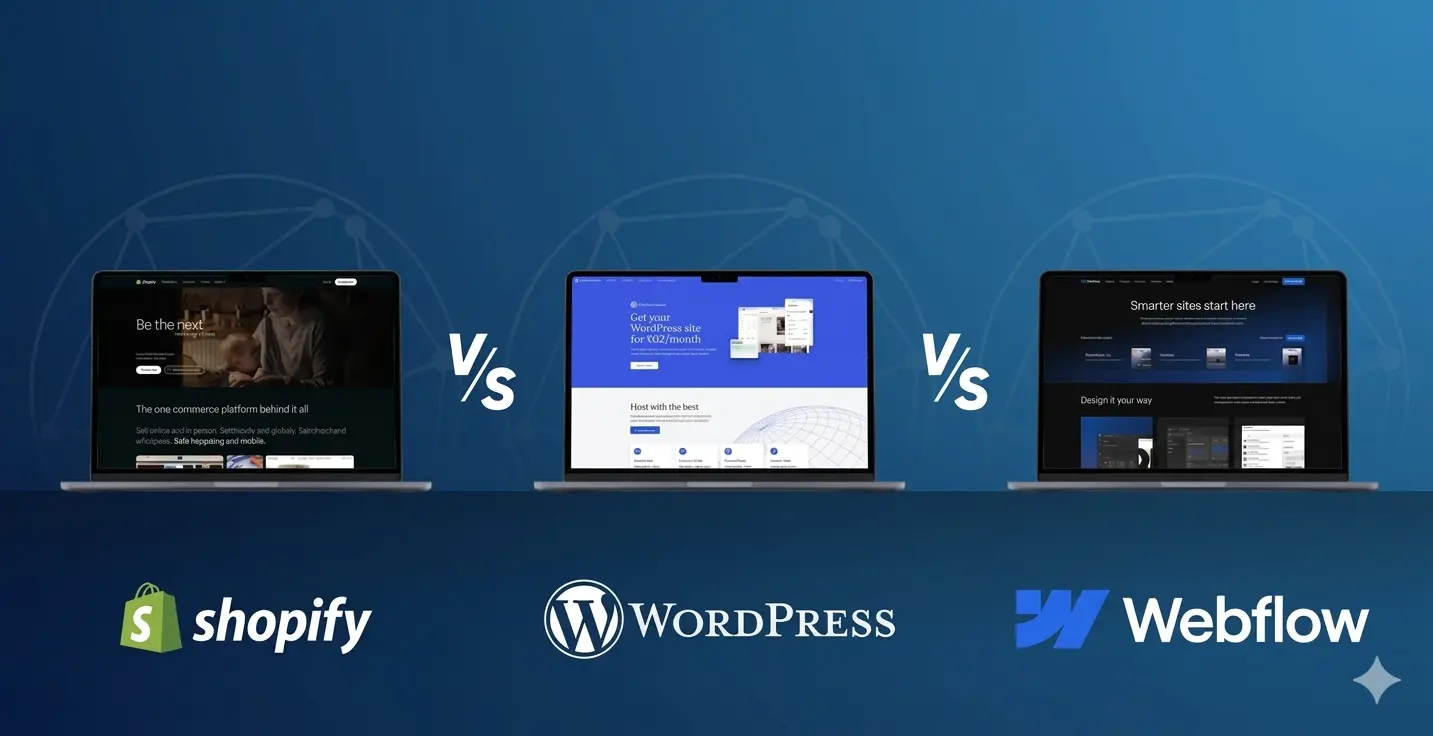
How to fix it: A redesign is the right time to migrate to a modern, user-friendly CMS that allows your team to make updates independently, whether that's WordPress, Webflow, or another platform suited to your business size and technical comfort level. The goal is a site you can maintain without needing a developer on retainer for every small change. Part of a well-run redesign process should also include light training for whoever on your team will be making updates, so the investment in an easier-to-manage platform actually translates into a website that stays current.
Businesses evolve. You might have rebranded, expanded into new services, shifted your target audience, or simply matured as a company since your website was last built. If your site still talks about services you no longer offer, uses old logos or color schemes, or speaks to a customer profile you've since moved beyond, it's creating a disconnect between who you are now and what your website says about you.
This mismatch erodes trust quickly. Customers who find inconsistencies between your website and your actual current business (whether through reviews, social media, or word of mouth) start to question what else might be outdated or inaccurate.
How to fix it: Treat your redesign as a brand alignment exercise, not just a visual update. Revisit your messaging, your service descriptions, your imagery and your overall positioning to ensure the entire site reflects where your business is today, not where it was three or five years ago.
This one is uncomfortable to admit, but it's often the trigger that finally pushes business owners to act. If you've looked at a competitor's site and felt a pang of "wow, ours looks rough by comparison," that instinct is worth trusting. Customers comparing options are making the exact same comparison, just with less emotional attachment and a lot more willingness to click away.
In competitive industries and metro markets, like a redesign company in New York competing against dozens of established agencies, or a web revamp project in Miami going up against polished local competitors, design quality often becomes a genuine differentiator, not just an aesthetic preference.
How to fix it: Conduct a competitive audit as part of your redesign process. Look at what your top three to five competitors are doing well, where they're falling short and how you can position your new site to feel more credible, modern and trustworthy than the alternatives your prospects are considering.
If you're not entirely sure how visitors are finding your site, which pages they're engaging with, or where they're dropping off before converting, you're essentially running your business website blind. Many older websites either lack proper analytics integration entirely or have tracking that was set up incorrectly years ago and never maintained.
This is a serious problem because it means every decision about your website, what to change, what to keep, what to invest in, is based on guesswork rather than data.
The cost of flying blind shows up in subtle ways. You might assume your blog content is driving leads when in reality it's barely getting traffic, while a single service page you've never paid attention to is quietly generating most of your conversions. Without proper tracking, you can't tell the difference, which means future investment decisions, whether to spend more on content, ads, or a particular service line, end up based on intuition rather than evidence. For a business spending real money on marketing, this gap between perception and reality can be expensive.
How to fix it: A redesign should include proper analytics and conversion tracking from day one: tools like Google Analytics 4, heatmapping software and goal tracking tied to actual business outcomes (form submissions, calls, purchases). This gives you the visibility needed to make informed decisions long after the redesign is complete. Setting up clear dashboards or regular reporting at this stage also means you won't need to revisit your analytics setup again until your next major site change, rather than discovering gaps in your data months down the line.
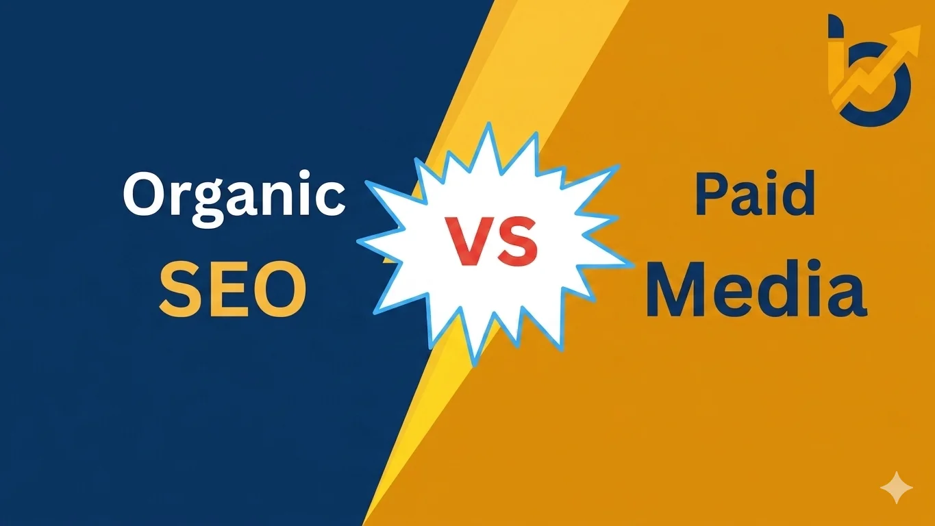
A beautiful website that no one can find isn't doing its job. Many older or template-based websites were built with little to no consideration for SEO fundamentals: messy URL structures, missing meta data, slow load times, poor heading hierarchy, or thin content that doesn't address what your audience is actually searching for.
The result is a site that might look fine to visitors who already know about your business but struggles to attract new visitors through organic search, which is often the most cost-effective long-term channel available to small and mid-sized businesses.
How to fix it: SEO needs to be baked into the redesign process from the start, not bolted on afterward. This includes clean technical architecture, optimized on-page elements, mobile-first performance and a content strategy aligned with what your customers are actually searching for. If this sounds like a separate workstream, it's worth exploring it alongside our dedicated SEO services for a more complete fix.
If you read through this list and found yourself nodding along to two or three signs, it might be time for some targeted updates. If you recognize five or more, your website redesign isn't really optional anymore; it's a business decision with a direct line to your bottom line.
The good news is that a redesign doesn't have to mean starting from zero or disrupting your operations for months. With the right partner and a clear strategy, it's possible to modernize your site's design, speed, mobile experience and conversion path while preserving everything that already works.
At IB2Marketing, we work with businesses across the United States, from local service providers to growing e-commerce brands, to turn underperforming websites into assets that actually drive growth. Our approach to redesign isn't purely cosmetic. We look at design, speed, mobile experience, SEO and conversion strategy as one connected system, because that's how your customers actually experience your site.
Whether you're a small business in Miami trying to compete with bigger local players, a growing company in New York looking to modernize before a major push, or a business anywhere else in the US wondering whether your current site is holding you back, our team approaches every redesign with the same goal: build a website that works as hard as you do.
We start every engagement with a clear, honest look at what's working on your current site and what isn't, no guesswork, no generic templates, just a strategy built around your actual business goals and your actual customers. From there, our process typically moves through a few clear phases: a discovery and audit stage where we map out exactly what's underperforming, a design and content phase where we rebuild the visual experience and messaging around what your customers actually need to see, a development phase focused on speed, mobile performance and a CMS your team can actually manage and finally a launch and measurement phase where we make sure analytics and conversion tracking are properly in place from day one.
This isn't a one-size-fits-all template applied to every client. A redesign for a Miami-based hospitality brand competing on visual appeal looks very different from a redesign for a New York B2B service firm competing on credibility and authority. We tailor design direction, content strategy and technical priorities to match your specific market, your specific competitors and the specific customers you're trying to reach.
You don't have to guess whether your website needs a redesign. Get a free, no-pressure audit from our team and find out exactly where your site is losing visitors, leads and revenue, along with clear, actionable recommendations on how to fix it.
How do I know if my website is outdated?
A few clear indicators include a design that looks visually dated compared to competitors, a non-mobile-friendly layout, slow page load times, content that no longer reflects your current services or branding and a high bounce rate. At IB2Marketing, our free website audit evaluates all of these factors so you get a clear, objective answer rather than relying on guesswork.
When should I redesign my website?
Generally, businesses should consider a redesign every two to three years, or sooner if you notice declining traffic, low conversion rates, mobile usability issues, or a recent rebrand that your site doesn't reflect. IB2Marketing helps US businesses identify the right timing based on real performance data, not just an arbitrary schedule.
How long does a website redesign typically take with IB2Marketing?
Timelines vary based on site complexity, but most business website redesigns with IB2Marketing are completed within four to eight weeks, covering strategy, design, development and testing. We'll provide a specific timeline once we understand the scope of your project during your free audit.
Will a redesign hurt my current SEO rankings?
Not if it's done correctly. IB2Marketing builds SEO considerations directly into the redesign process, including proper URL redirects, preserved metadata and technical optimization, so your site typically sees improved rankings post-launch rather than ranking losses.
Does IB2Marketing work with businesses outside of major cities like New York or Miami? Yes. While we work with businesses in competitive metro markets across the US, our web design and redesign services support businesses of all sizes nationwide, regardless of location. Every project starts with a free website audit so we can tailor our recommendations to your specific market and goals.
A Performance Marketing Company Delivering Results-Driven Solutions For Businesses


Have a question? We’d love to hear from you. Send us a message and we’ll get back to you as soon as possible.
Send 609-596-5511