Picture this: a potential customer in Houston pulls out their phone, searches for a service exactly like yours, taps your link from the results page and waits. The page loads slowly, the text is too small to read without pinching and zooming and the navigation menu refuses to cooperate with their thumb. Within seconds, they hit the back button and click on a competitor instead. That single moment, repeated thousands of times across the country every day, is why mobile-first web design has stopped being a "nice to have" and become the foundation of a successful online presence for American businesses.
The way people browse the internet has fundamentally shifted and most business owners simply haven't caught up. They still think about their website the way they did in 2015: design it for a desktop monitor, then "make it work" on phones as an afterthought. That approach is now actively costing businesses customers, search rankings and revenue. In this guide, we'll break down exactly what mobile-first web design means, why it matters more than ever for SEO and conversions and how IB2Marketing builds responsive, fast-loading websites that perform on every device your customers use.
Mobile browsing isn't a trend anymore, it's the default. Over 60% of all web traffic in the United States now comes from mobile devices and that number continues to climb as smartphones become more capable and more central to daily life. People research restaurants on their phones while standing outside them. They compare contractors while sitting in their car in a parking lot. They read product reviews on the subway, book appointments during lunch breaks and make purchasing decisions from their couch with a phone in hand instead of a laptop on their desk.
This shift isn't limited to younger demographics either. Mobile usage spans every age group, every income bracket and every region of the country, from mobile website designer USA searches originating in dense urban centers to small towns where a smartphone is someone's primary or only internet-connected device. Businesses that assume their audience is sitting at a desktop computer are designing for a customer who, statistically, often doesn't exist anymore.
For local and regional businesses especially, this matters enormously. A responsive design company Houston business owner hires needs to understand that the person searching for "plumber near me" or "best Tex-Mex restaurant" is almost certainly doing so from a phone, often while they're already out and about and ready to make a decision quickly. The same is true across the country. A mobile web design Los Angeles agency client knows that LA traffic patterns alone mean people are searching, comparing and deciding from their phones constantly throughout the day, not just at home in the evening.
When your website isn't built with this reality in mind, you're not just providing a slightly worse experience, you're actively losing the majority of the people who try to find you.
Let's clear up a common misconception right away: mobile-first web design is not the same thing as having a website that "works okay" on a phone. It's a fundamentally different design philosophy and understanding the distinction is the first step toward building a site that actually performs.
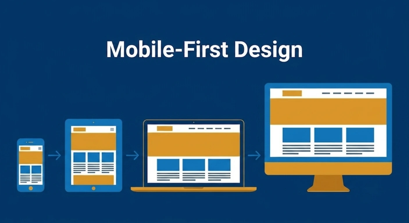
Mobile-first design means starting the entire design and development process with the smallest screen first, then scaling up to tablets and desktops. Instead of building an elaborate desktop experience and then cramming, shrinking and hiding elements to make it fit on a phone, designers begin with the constraints of a mobile screen limited space, touch-based navigation, variable connection speeds and build outward from there.
This approach forces smarter decisions from the start. When you only have a few inches of screen real estate to work with, you're forced to prioritize. What does this visitor actually need to see first? What's the one action you want them to take? Which images, paragraphs, or widgets are truly essential and which are just clutter that desktop design conventions taught us to include? Mobile-first design strips a website down to what matters and then thoughtfully adds complexity back in as screen size allows.
This is different from "responsive design" in a subtle but important way, even though the two concepts are closely related and often used together.
Responsive web design refers to the technical method of building a website so that its layout adapts to different screen sizes, images resize, columns stack, navigation menus collapse into hamburger icons and so on. It's the "how."
Mobile-first design is the strategy or philosophy behind that technical execution; it's the "why" and the "in what order." A site can technically be responsive while still being designed desktop-first, meaning the desktop experience was built first and then adjusted downward for mobile. The result is often a mobile experience that feels like a compromise: slower load times because of unnecessary desktop assets, awkward layouts because elements were squeezed rather than designed intentionally and navigation that was an afterthought rather than a starting point.
True mobile-first responsive design flips that order. The mobile layout is the baseline and additional features, larger images, multi-column layouts and expanded navigation are layered on as the screen grows. The outcome is a leaner, faster, more intentional experience at every screen size not just damage control on the smallest one.
Here's where mobile-first design stops being a design preference and becomes a business necessity: Google's ranking algorithm is fundamentally built around it.
Google made a sweeping change to how it crawls and ranks websites by moving to what's known as the Google mobile index, or mobile-first indexing. In practical terms, this means Google predominantly uses the mobile version of your website's content for indexing and ranking, not the desktop version. If your mobile site is stripped down, missing content, slower, or harder to navigate than your desktop site, Google sees that diminished version as the "real" version of your website when deciding where to rank you in search results.
This is a critical point that many business owners miss. They'll proudly show off a polished desktop website during a sales meeting, completely unaware that Google has been evaluating and ranking their site based on a mobile experience that's broken, cluttered, or painfully slow. If your mobile site underperforms, it doesn't matter how beautiful your desktop site looks. Your rankings will suffer across the board, on desktop searches too, because Google's index doesn't maintain two separate scores for two separate experiences.
This is precisely why mobile-first web design and SEO can no longer be treated as separate disciplines. A site built mobile-first is, by definition, optimized for the index Google actually uses to evaluate and rank it.
Mobile-first design also directly impacts page speed and page speed is one of the more heavily weighted factors in modern search rankings. Google's Core Web Vitals metrics that measure loading performance, interactivity and visual stability are evaluated primarily on mobile data. A page that loads in two seconds on a fast office Wi-Fi connection might load in eight or ten seconds on a spotty 4G connection in a moving car and that's the experience your real-world mobile visitors are often having.
Mobile-first design forces smaller, more compressed images, leaner code and fewer unnecessary scripts from the outset, because those constraints are baked into the process from day one rather than bolted on afterward. The result is a faster site, which search engines reward and which visitors are far more likely to stick around for. Research has consistently shown that even a one-second delay in load time leads to measurable drops in conversions and mobile users often on the move, often impatient, often one tap away from a competitor's site are even less forgiving of slow load times than desktop users.
For businesses targeting specific markets, mobile-first design is also deeply tied to local search visibility. Searches like "responsive design company Houston" or "mobile web design Los Angeles" are overwhelmingly conducted on mobile devices, often with local or "near me" intent baked in. Google's local search algorithm takes mobile usability into account as part of its broader ranking signals, meaning a poorly optimized mobile site can actively hurt your visibility in the local map pack and local organic results the exact placements that drive foot traffic and phone calls for local businesses.
If you're investing in local SEO efforts but your mobile site isn't keeping pace, you're undermining your own strategy. The two need to work together, which is exactly why a strong web development partner should be thinking about SEO services from the very first wireframe, not treating it as a separate project that happens after the site launches.
Search rankings get businesses to the door, but user experience determines whether visitors walk through it or turn around and leave. Mobile-first design directly shapes several UX factors that have an outsized impact on conversions.
One of the most overlooked aspects of mobile design is that people aren't using a precise mouse cursor; they're using fingertips, often while walking, holding a coffee, or multitasking. Good touch UX means buttons and links are sized and spaced appropriately so users don't accidentally tap the wrong element. It means forms are simplified, with input fields large enough to tap accurately and keyboard types that match the expected input (a numeric keypad for phone numbers, for example, rather than a full keyboard).
It also means designing for thumb reach. Most people hold their phone in one hand and navigate with their thumb, which means the most important actions a "Call Now" button, an "Add to Cart" button, a primary navigation menu should be positioned within comfortable thumb range, typically toward the bottom or center of the screen, rather than tucked into a far corner that requires an awkward grip adjustment.
The viewport is the visible area of a web page on a user's device and properly configuring it is one of the most basic yet most frequently botched technical requirements of mobile design. A correctly set viewport meta tag tells the browser to render the page at the device's actual width rather than shrinking down a desktop-sized layout to fit the screen, which is what causes that frustrating experience of having to pinch and zoom just to read text. Sites that get the viewport wrong are immediately flagged as non-mobile-friendly by both users and search engines.
Desktop navigation menus with a dozen dropdown items work fine with a mouse hovering over each option. On mobile, that same menu structure becomes a nightmare of tiny tap targets and accidental selections. Mobile-first navigation design typically means simplified menu structures, clear hamburger or bottom-tab navigation and a focus on getting users to their destination in as few taps as possible.
Long, complicated forms are conversion killers on any device, but they're especially punishing on mobile. Mobile-first design encourages shorter forms, auto-fill compatibility and streamlined checkout processes because every additional field a user has to manually type on a phone keyboard is another opportunity for them to abandon the process entirely.
As mobile-first design has matured, a handful of technologies have emerged specifically to make mobile experiences faster and more app-like. While not every business needs every one of these tools, understanding them helps clarify why a thoughtfully built mobile site outperforms a generic template.
AMP (Accelerated Mobile Pages) is a stripped-down version of HTML designed to load near-instantly on mobile devices, particularly useful for content-heavy pages like blog posts and news articles. While AMP's role in search has evolved over the years, the underlying principle of radically simplified, fast-loading mobile pages remains central to good mobile-first thinking even when AMP itself isn't used.
PWAs (Progressive Web Apps) take mobile-first design a step further by allowing a website to function more like a native app: capable of working offline, sending push notifications and being "installed" on a user's home screen without going through an app store. For businesses with frequent repeat visitors, think appointment-based services, e-commerce stores, or membership platforms, a PWA can dramatically improve engagement and retention by making the mobile site feel as fast and reliable as a dedicated app, without the cost and complexity of building one.
These technologies aren't relevant to every project, but they represent the direction the entire web is moving: faster, lighter, more app-like experiences built around how people actually use their phones.
It's worth being direct about the cost of inaction, because the consequences of a poor mobile experience compound over time.
Slow, clunky, or broken mobile websites lead to higher bounce rates, since visitors leave within seconds rather than exploring further. They lead to lower search rankings, since Google's mobile-first index penalizes sites that underperform on mobile regardless of how strong the desktop version is. They lead to lost conversions, since frustrated users simply don't complete purchases, fill out contact forms, or pick up the phone to call. And perhaps most damaging long-term, they lead to a quiet erosion of brand trust. A clunky mobile experience subtly signals to visitors that a business is outdated or doesn't pay attention to detail, even if the underlying product or service is excellent.
Meanwhile, every dollar spent on paid advertising, content marketing, or local SEO efforts driving traffic to a poorly optimized mobile site is a dollar that's working against itself. You can't out-market a bad website. If most of your traffic is mobile and statistically, it is then your mobile experience is effectively your business's first impression for the majority of potential customers.
This is exactly the gap IB2Marketing exists to close. Rather than treating mobile compatibility as a final checkbox before launch, our web development process is built around mobile-first principles from the very first strategy conversation.
We start by understanding how your specific customers actually behave whether that's a Houston-based service business fielding "near me" searches from people on the go, a Los Angeles e-commerce brand competing for attention in a crowded mobile marketplace, or a nationwide company whose audience spans every device and connection speed imaginable. From there, we design mobile layouts first, prioritizing speed, clarity and intuitive touch navigation, before scaling the experience up thoughtfully for tablets and desktops.
Every site we build is evaluated against real performance benchmarks, not just visual polish: load times, Core Web Vitals scores, mobile usability and how well the structure aligns with Google's mobile-first indexing standards. Because we approach web development and SEO services as deeply connected disciplines rather than separate departments, the sites we launch aren't just attractive; they're built to rank, load fast and convert the mobile-majority audience that's actually visiting them.
If you're unsure how your current website is performing on the devices your customers actually use, that's a question worth answering before another month of traffic slips through the cracks.
What is mobile-first web design and how does IB2Marketing approach it?
Mobile-first web design means building a website starting with the smallest screen size first, then scaling the layout up for tablets and desktops, rather than the reverse. At IB2Marketing, every project begins with mobile wireframes and performance benchmarks before desktop design work even starts, ensuring the experience is fast and intuitive on the devices most of your customers actually use.
Why is mobile design important for SEO and how does IB2Marketing factor this in? Google primarily uses the mobile version of a website to determine search rankings through its mobile-first index, so a weak mobile experience can hurt your visibility even if your desktop site looks great. IB2Marketing builds web development and SEO services together from the start, so the sites we launch are structured to perform well under Google's mobile-first indexing standards from day one.
Does IB2Marketing build responsive websites for businesses outside of Texas and California?
Yes. While we work closely with clients searching for a responsive design company in Houston or mobile web design in Los Angeles, IB2Marketing builds mobile-first, responsive websites for businesses across the United States, regardless of location or industry.
How can I find out if my current website is mobile-friendly?
IB2Marketing offers a free mobile score check that evaluates your website's mobile speed, usability and overall performance against current Google mobile-first standards, giving you a clear picture of where your site stands and what's holding it back.
Does IB2Marketing build Progressive Web Apps (PWAs) or AMP pages?
Yes, when it fits a client's goals. For businesses that rely on repeat visitors or content-heavy pages, IB2Marketing can incorporate PWA functionality or AMP-style optimization as part of a broader mobile-first strategy, ensuring the site stays fast, reliable and app-like where it matters most.
A Performance Marketing Company Delivering Results-Driven Solutions For Businesses




Have a question? We’d love to hear from you. Send us a message and we’ll get back to you as soon as possible.
Send 609-596-5511